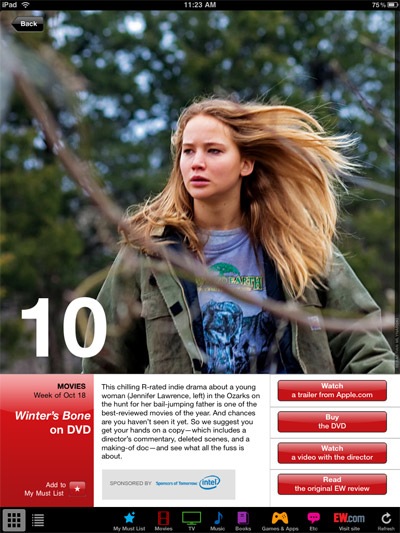
Wired isn’t the only magazine that needs to be more careful about text that refers to images in a dual mode reading environment. I rather like Entertainment Weekly‘s The Must List app for iPad, and check out their 10 picks every week — I like how you can watch trailers and sample tracks from within the app. But today I spotted another lazy mistake, as the text above refers to a photo on the left, which only works when reading in landscape. Unlike Wired, this is not a case of using text destined for print, so it’s really a matter of having designed for one orientation, and forgetting about the other.
![Jean Snow [.net]](https://www.jeansnow.net/wp-content/uploads/2024/04/js_logo_dark.gif)