Today finally marked the release of Wired‘s October issue on iPad — as I noted yesterday, it’s later than usual — and I of course have a few things to say. First off, they again go ahead with their trick of making you update the app to get the new issue instead of just using notifications, something I’m assuming is to help them rank again on charts when a new issue comes out. Are they (Conde Nast) going to be doing that with the New Yorker as well, on a weekly basis? Oh, and in the “what’s new” notes they include “issue size improvements” as a feature — the issue download was around 290MB, compared to the 400-500MB of past issues.
But what I really want bring up this time is the question of orientation. It’s a topic Jeremy has been bringing up a lot on MagCulture — most recently in his review of the New Yorker — and it comes down to the hard fact that supporting both of the iPad’s orientations means having to design your magazine twice, which means more work for the design staff.


Since the release of its first issue on iPad, to its credit, Wired has been having some fun with the dual orientation layouts, often using completely different photos to illustrate the same story, like in the example above. That’s all fine and dandy, and it can be a neat little “easter egg” to discover, but I’ve been noticing quite a few errors creeping up in text as well, as it relates to orientation changes.
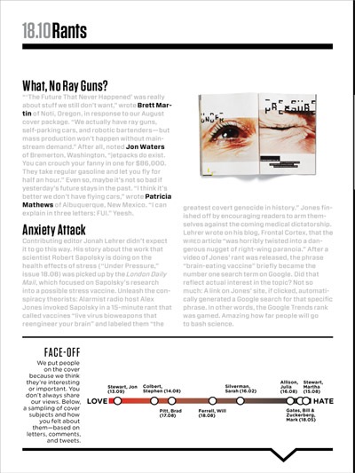
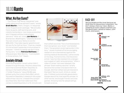
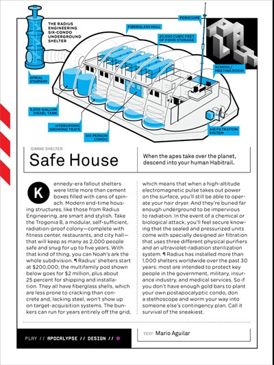
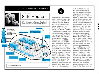
In the example above, the “FACE-OFF” sidebar, the intro text refers to the chart “below” in both instances. That’s correct when in landscape mode, but not in portrait mode. In some cases, they’re just plain wrong no matter what orientation, which could be a remnant of text referring to the print layout, but that’s not something that should be creeping in the digital edition. As an example, the text in the “Safe House” article (below) refers to the pod shown “below,” even though in both cases it appears in different spots (above, and to the left).
This may be nitpicking, but for me it amounts to having the wrong caption under an image. When I was reading the “Safe House” article in portrait mode and hit on the mention of the “pod shown below,” my immediate reaction was to swipe down to the next page.
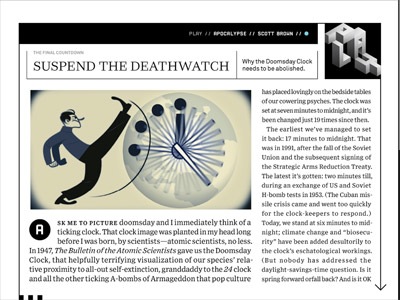
But another point to bring up is how all of these double layouts are affecting the text formatting. It’s an important point: Since you have to keep the same amount of text no matter the orientation, it can result in some forced constraints. Look at the text below, the second line of the paragraph — the tracking on it is horrendous. The text is fine if you’re reading in landscape mode.
I’m not sure if I’m siding with Jeremy just yet though. Even though I tend to read in portrait more, I do like having the option, and I do often find that the layout in landscape mode is a tad more attractive (but I do realize this is just subjective). But more care has to be done for it to work properly, or else depending on the orientation you pick, you’re going to end up with a different — and possibly subpar — reading experience.
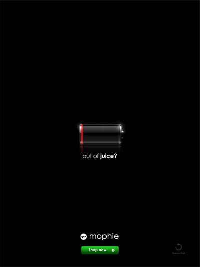
Let me end with an ad from the issue that I rather liked. I don’t know if the same ad appears in the print edition, but it obviously works very well when seen on an iPad. It’s also in keeping with the theme of this post: You only get it in portrait mode, with the landscape version featuring a different image.