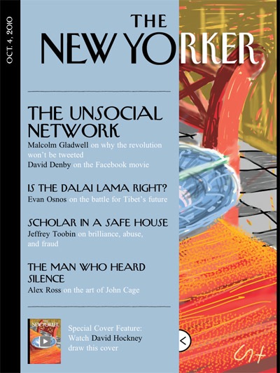
The big news in the digital magazine world this week is of course the release of Conde Nast’s The New Yorker app. It was designed by the same team behind the Wired magazine app — creative director Scott Dadich is in fact now in charge of bringing all of the publisher’s stable of titles to iPad.
The first thing I’ll suggest is that you take a look at Jeremy’s great write-up over at MagCulture — he also posts the terrific video intro produced for the launch, directed by Roman Coppola and starring Jason Schwartzman.
In terms of my experience with the magazine so far (I’m not yet done going through it), it started out badly with a crash as I tried to play a video from the front cover that is supposed to show that cover being drawn. No matter how many times I exited and re-entered the app, it would just show the video screen, and I couldn’t get back to anything else. After deleting the app and re-installing it, and then re-downloading the issue, I was able to start reading the magazine, but that video still refuses to play for me.

As Jeremy mentions in his review, what you get here is very similar to the interface used in the Wired app (menu functions are all the same), and the biggest change lies in the page design, which is much more simple — in keeping with the source material — with text that is less formatted as well (columns of text run down until they’re done, not necessarily at the bottom of the page).
It also uses free scrolling more than in Wired, where you only see it in the table of contents and credits page at the end. As I’ve said before, I’d really prefer if they just kept to the page scrolling, which I rather like — maybe in part because it feels more magazine-y to me.
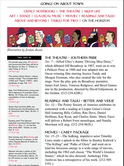
It was interesting to see a bit of live content appear in the magazine. Pictured above, you see that “This Just In” section is made up of tweets with updated event information. Even Wired hasn’t included any live content yet.

Looking at the ads, The New Yorker app introduces another first for the Conde Nast interface, and that’s the inclusion of ads within an article, as you scroll down — so far the Wired app has kept ads to themselves, in-between articles.
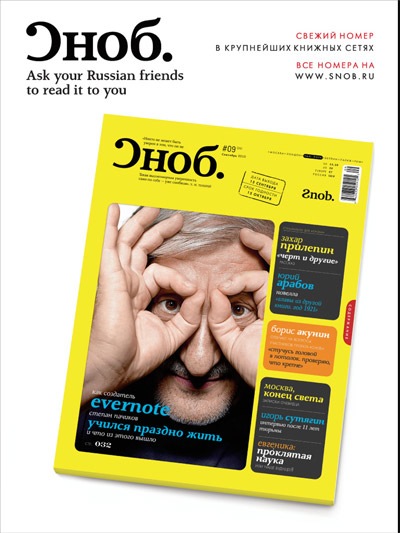
I also had to share the ad pictured above, for a Russian magazine I’ve never heard of, with a title I have no idea how to pronounce, but that I now want to read. What a great tagline!

My biggest gripe right now is the pricing, which is $5. I’m sure they decided to charge more than they do for Wired ($4) because they don’t expect to get the same sales numbers, but I think a lot of people are going to be turned off by the price, especially for a weekly, and especially with so much of the content being city-centric (it did make me want to make a move to New York though, I’ll give them that).
Let me end this with one of the comic strips (above) found inside. The joke for me and my wife is that our dog has escaped from his cage so many times that we’ve given him the nickname Houdini, and so you can imagine how much of a chuckle I got when I saw that strip.
![Jean Snow [.net]](https://www.jeansnow.net/wp-content/uploads/2024/04/js_logo_dark.gif)