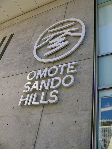
Omotesando Hills has garnered its fair share of critisism — it’s no secret that CrissCross’ Mark Devlin doesn’t like it much, as he’s stated in a METROPOLIS essay, and also in this comment thread, where he specifically points out problems — and since I had a chance to visit the place on opening day (and took plenty of photos), here are a few thoughts.
- As I’ve said in the past, I have no real interest in the stores here, same as with Roppongi Hills. I’m not the target audience for this, and I can’t see myself going there often because of it. The basement floor does include a few non-clothing stores, but even then, a store like Delfonics gets turned into an upscale boutique. But, the Amadana store is nice (the Amadana products are so damn nice that it’s like walking through a gallery), Idea Frames has a good selection of items (but nothing you won’t find elsewhere), and then there’s the Taschen store (but it’s only open until May).
- One pleasant surprise, and something I wasn’t expecting at all, was the presence of a few gallery spaces. There were two on the front side of the complex (with access directly from the street), and then two in the east wing (one devoted to an exhibition of the old Dojunkai complex, and the other, Galerie 412, returning from the Dojunkai days, bringing its original shop door with it).
- As someone pointed out in a comment thread, yeah, it’s a mall, and it does feel like one. Admittedly, I was there on opening day, and the huge crowds didn’t help.
- Now, the big question is regarding its architectural resonance. The opinion of most is that it’s this big ugly thing. Well, I think that as a whole, it works better than Roppongi Hills, but it’s not ideal. Sure, it doesn’t have the atmosphere of the old Dojunkai buildings, and does seems a bit tame for an Ando creation. Also, it’s a shame that there is no access to the rooftop garden (the small terraces on one end of the complex just don’t do it). I do like the ramp system found in the main area, which guides you as you walk around and window shop. It’s not an eyesore, but it doesn’t really measure up to the design originality of the other big-name flagship stores in the area.
- They have a closed-off smoking room, so you need to give them a few points for that (and then close to it a smoke-free resting lounge). Also, plenty of bicycle parking spaces within the complex (with mounting racks).
- Oh, and as a bit of trivia, the OH ad campaign (with the illustration of people walking) is by Julian Opie.
So a few first impressions. I’m not in love with the place, but my likeness for novelty makes it so that I can’t be against re-doing parts of the city — I do get excited by the creation of these big complexes (and there are quite a few more on the horizon). I do agree with a reader who mentioned that one scary aspect of all this is seeing Mori having too strong an impact on the Tokyoscape, and I certainly don’t want to see my beloved town turned into a collection of “Hills.” I do look forward to going back to OH on a less crowded day to have a second look.
![Jean Snow [.net]](https://www.jeansnow.net/wp-content/uploads/2024/04/js_logo_dark.gif)