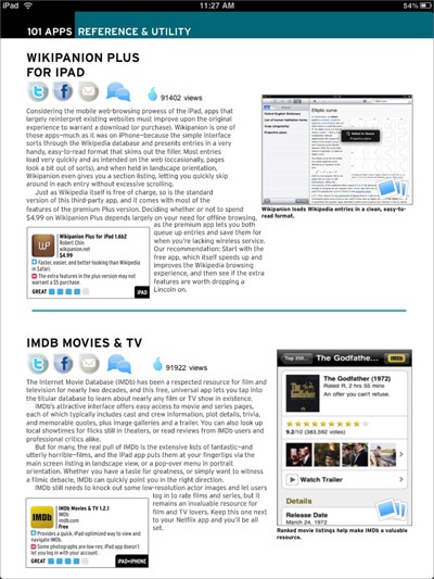
What’s wrong with the picture above? My beef with it is that it’s a page from the new iPad edition of MacLife magazine — they’ve just launched a free “zero” issue — but it looks like pretty much any blog post, with it’s row of “social sharing” icons. Don’t get me wrong, I absolutely want iPad magazines to embrace the idea of sharing interesting articles, note taking, and all that great functionality that the digital medium can exercise over print, but this is not how I want it done. There are much better ways of integrating all that functionality without using what amounts to “web aesthetics.” Just look at iBooks, touch the screen and you then gain access to your bookmarking-highlighting-note taking tools.
I will say that the MacLife experiment does have some good points, and that it’s nice to see how the creators really want to marry the best of digital and print — it’s the first magazine I see that includes commenting threads for each article, and at least those are hidden and live on their own pages. But it hasn’t quite found the right balance.
![Jean Snow [.net]](http://www.jeansnow.net/wp-content/uploads/2024/04/js_logo_dark.gif)