This is the lost post I referred to recently, which to my surprise suddenly popped up again in my draft folder, and so I’ve decided to share it as is, along with a little update at the end.
The Magaziner returns. Sorta.
In recent weeks, I’ve been feeling the itch to bring back The Magaziner in one form or another – and for those of you who have no idea what I’m referring to, it’s a site I ran that was dedicated to the love of magazines, with a slight focus on digital titles/editions. Problem is, earlier this year I let the original domain expire – I did check to see if it was still available, but it wasn’t.
Oh well.
But, I still feel like sounding off on magazines again, since my love for the medium is still strong, and so – for now – I’ll just do it here in the form of irregular posts.
Let’s talk about Edge magazine, and its new digital strategy as of its latest issue.

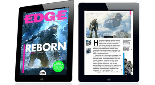
First off, Edge is what I would describe as the best and smartest magazine out there covering the world of games. It covers the medium in all seriousness, and is a publication that is read by many in the industry. It’s published in the UK through Future. I’ve been reading it for years – can’t quite remember what my first issue was – and although I used to buy it in print (at a ridiculous price from a shop in Tokyo’s Akihabara district), when they launched a proper iPad edition – and by this I mean a digital edition formatted for iPad, that they described as an “interactive” edition – that’s how I continued reading it. As of the latest issue, that “interactive” edition is no more.
What has happened is that what you get now is basically a glorified PDF version of the print edition, with a few highlighted links to look up a gallery of screenshots or to watch a video. On iPads designed for mortals (i.e. not the new iPad Pro), this means that you can’t read the text in regular page view, and so need to constantly zoom in and out of pages. Oh, and now it won’t even save your spot when you’re reading, so every time you come back to the issue, you’re at the front page, and need to manually find your spot again.
Why revert back to such a primitive edition? I’m sure it was a business decision, not wanting to absorb the cost of designing that iPad edition, but not only does it leave us with a fantastically unsatisfying reading experience, they haven’t even lowered the cost of the digital edition.
The content itself is still great – in the latest issue I really enjoyed the interview with Final Fantasy XV director Hajime Tabata, the profile of Square Enix’s new RPG Factory studio, and the piece on adventure game studio Revolution Software, but because of the awful reading experience, I found myself skimming over most of it.
I’ve already cancelled my digital subscription, and I don’t expect I’ll be buying the print edition as it’s not readily available here, and would cost import prices if I did find a copy. If I am still able to read some of it, it will be because the studio where I work subscribes to it.
Update: Since I wrote this, to my dismay, another one of my regular magazine reads has followed the same route, and it’s even worse than with Edge. As of its latest issue (with Star Wars on the cover), Rolling Stone has done the same thing, getting rid of its iPad-formatted interactive design and instead releasing a PDF-like replication of the print edition. But what’s worse is that it’s even more unreadable than Edge, because you can’t even zoom in on the pages, and so if you find the text to be too tiny to read, tough luck. I immediately cancelled my subscription, but really, I’m just shocked to see a backward trend like this of giving up on digital editions. I’m sure it’s all driven by sales and cost cutting (not wanting to invest in designing a separate edition), but it is having the effect of making me leave those titles, since I’m not interested in the print editions (I only like print magazines if they use nice paper, have a special format, etc.)
![Jean Snow [.net]](http://www.jeansnow.net/wp-content/uploads/2024/04/js_logo_dark.gif)