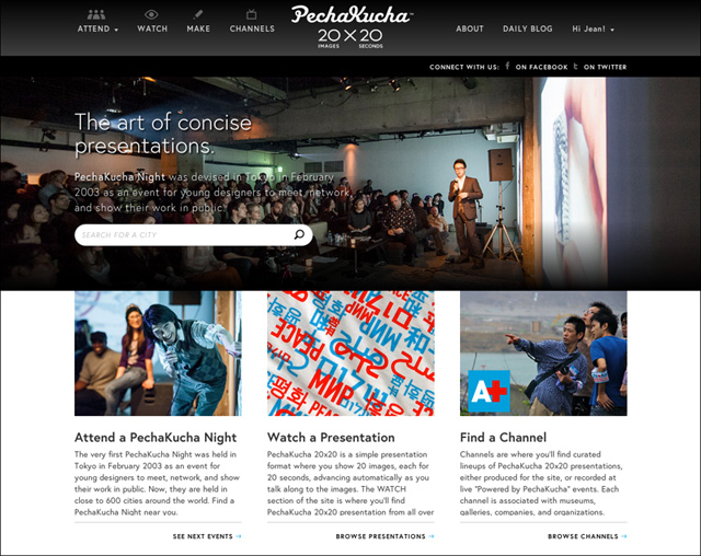
The new PechaKucha website is now live.
It’s been live for a few days now, and I hope you all take some time over the holidays to check it out, and see what we’ve been up to for a good part of the past year, and take in a few presentations.
It’s a drastic re-imagining of our web presence, and something that was very much due — the previous site, built 4-5 years ago, wasn’t up to dealing with today’s ultra-sharable and mobile landscape. We worked with Chicago’s Firebelly and Table XI on the project, which was a fantastic experience — on my end, I dealt more closely with Table XI (the company behind the site’s programming), and offer big thanks to Mark Rickmeier and Melissa Sevilla for dealing with my constant stream of comments and feedback.
The look of the site is in good part due to the amazing work of Luis Mendo, who not only acts as our PechaKucha design director, but is a constant supplier of good vibes and comforting (for those times when things aren’t going the way we want them to).
And although it doesn’t need to be said, I of course thank Astrid Klein and Mark Dytham for not only inviting me on this crazy ride four years ago, but for also making me feel like I’m truly part of this grand adventure of ours.
There’s lots to take in with the new site, from stronger use of imagery throughout, more emphasis onsharing presentations online, and the introduction of “Channels.” You’ll also now find a “Presentation of the Day” featured on the front page of the site — today we mark the anniversary of the 2004 Indian Ocean tsunami by highlighting a presentation that looks at the reconstruction efforts that followed that terrible disaster.
And this is just the start — wait till you see what’s coming in 2013.
![Jean Snow [.net]](http://www.jeansnow.net/wp-content/uploads/2024/04/js_logo_dark.gif)