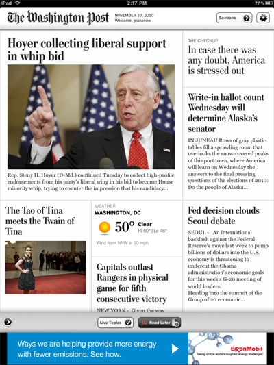
A few days ago, The Washington Post released an iPad app that gives you access to all of the paper’s content. Like the New York Times app, it’s free for now (as long as you register), but while the NYT hasn’t come out and said exactly when it will start charging, the Washington Post free trial ends in early February.
It’s interesting to see how the Washington Post has approached doing a newspaper app. Instead of the NYT‘s pop-up window to access sections — the only way you can do so — and then page flips to browse through articles excerpts within those sections, the Post goes the scrolling route. Each section is laid out like the front page of a newspaper, and you scroll down to see the excerpts — tapping an article also brings you to scrollable text, instead of the NYT‘s pages. I particularly like how you just swipe to the side to go from section to section — it’s a much easier way to quickly move through them.

As with the NYT app, one of the star features is how it deals with multimedia content, and here it again does the NYT one better by combining all photos and videos on one page, all laid out to see (above) — there’s a lot of flipping involved in going through galleries and videos in the NYT app. It’s kinda funny how one of the iPad’s first great apps, The Guardian Eyewitness, now comes off as quite sad these days, with its measly one photo a day content update.
Another feature I like is that it has a “Read Later” button that lets you save articles for reading at a later time — unlike the NYT that keeps articles in sections for a couple of days (even a week sometimes), with the Washington Post you access that day’s paper.
![Jean Snow [.net]](http://www.jeansnow.net/wp-content/uploads/2024/04/js_logo_dark.gif)