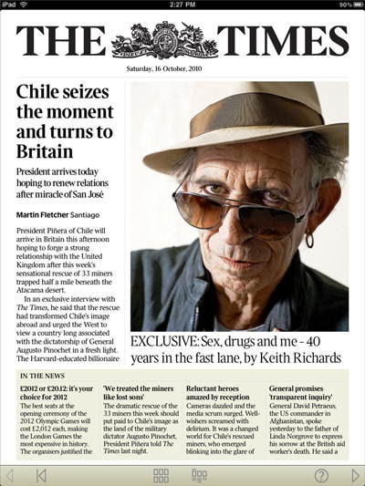
After my post the other day about the new NYT app, someone suggested I check out the one for The Times of London, since there’s a 30-day free trial — The Times app has been a very well known early proponent of not offering its content in app form (or web form) for free.
The first thing I encountered on the very first page was confusion caused by a non-linked item. It’s the page pictured above, and if you touch any of the news items you will go directly to the full article inside the issue, but for some reason that great big photo of Keith Richards, and even the headline below, doesn’t lead to anything. Yes, there is plenty of Richards-related content inside, but why not link to it? I spent some time trying to touch, double touch, and swipe away, as I couldn’t believe it was just a static item.
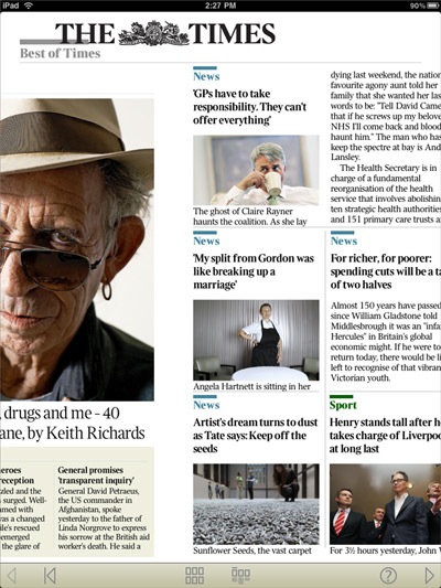
It’s nothing important, but I did like the way the large Times logo on the front page transitions into a smaller version as you swipe the page (I tried to capture the animation, and you can sort of see it in the image above, as it gets smaller). It’s just a nice little touch.
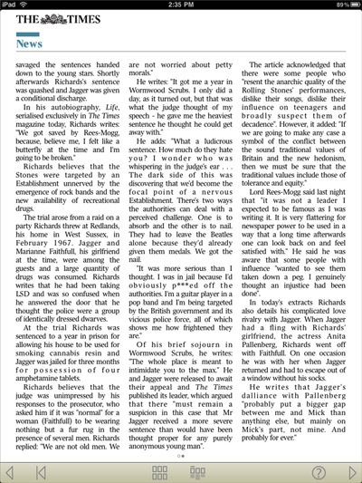
I did have a problem with the tight justified columns though — as you can see below, it makes for very ugly lines of text. I know we’re used to seeing this in a proper newspaper, but it doesn’t really work when you view it on a screen surface.
The biggest difference between The Times app and what the NYT app does is in terms of the way you work your way through the issue. While the NYT app simply adds new articles in each section, and they are then presented in summary form in a grid that usually includes between 5-9 pieces, here you not only download that day’s paper, you also have to swipe through every page, every section one after the other.
Sure, you can jump to different sections by accessing an index (pictured below), but since you are often just limited to a header and photo, it’s hard to tell if you really want to dig in. I do like scanning through a lot of news articles, and so the NYT format suits me best — there’s no way I’d want to have to flip through every article of the NYT. The fact that pretty much every single article in The Times leads with a large half-page (or more) photo does make it less painful, but still.

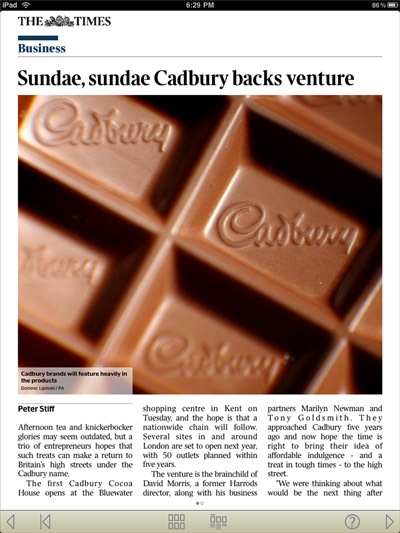
The other thing is that, with all the fuss that surrounded the launch of the app and the promise that it’s specifically formatted for iPad, I was expecting less of a template design and more creativity in layouts. But no, the vast majority of an issue follows the same look (you’ve seen pretty much all available layouts in the images included in this post). The only exception I found was for a feature at the end of the issue I downloaded that covered “Autumn Walks.” Pictured below, it does look rather nice, and I wish they would do more layouts like this.
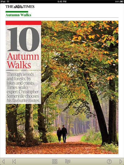
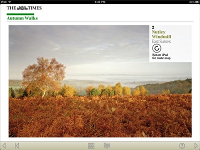
Also part of the feature, they had great descriptions of routes to follow, and it’s only by flipping to landscape mode that you could see a beautiful photo from that walk (as seen below).
But in the end, if I don’t stick with The Times it’s not because of what I mentioned above or even the subscription price, but rather that it’s just too UK-centric for me in terms of its coverage.