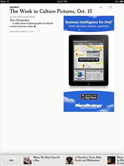
As I’ve written before, one my most-used apps on my iPad is the New York Times’ Editor’s Choice, despite its flaws. One of the biggest annoyances has been that it would include articles that were nothing more than slideshows (like “The Week in Culture Pictures”), but without the photos — how did something like this happen, considering it’s supposed to be a selection of articles, and not an automatic update of everything from the website?
So a few days ago the app morphed into a more complete version of the newspaper, including all sections, articles, videos, and photos. This is great, and I’m happy to have access to everything now, but why are we still getting articles like the one pictured above? To be fair, the slideshow is in fact in the app, but you have to access it separately from the “Photos” section.
The new app’s release also comes with a warning that it will remain free only until early 2011 — whether this means that the app will be sold or that a subscription for content will be required is unclear.
In terms of interface, it’s still similar to what we had before, except that accessing sections is now done from a pop-up window, and some articles now lead with a photo that takes up the entire width of the page — there’s also a “Section” navigation box that pops up at the bottom when you touch the screen once within an article (see above). The’ve also taken a cue from the web, and when you read an article, it then appears in a lighter color on the section’s page, to indicate it was read.
The biggest annoyance though is that it has been crashing a lot for me, and this even after a restart of my iPad. And when it crashes, re-opening it brings you to the “Top News” section, so you have to navigate back to where you were. It also feels like there’s a bit of a delay when you swipe through pages (within sections).