
The latest big title launch on iPad is Esquire, with its October issue getting an iTunes App Store release just a few days ago. Although Esquire has had an iPhone version for a while now with fluctuating prices (older issues are currently being sold for $2), the first iPad version is priced at $5, although it appears that nothing is set in stone yet.
It’s currently a single app download with no in-app store, but we’ve already seen a lot of first issues come out this way, and so there’s a very good chance that from next month the app will be updated to include a store component.
The first thing you should do is go here and watch the video the publisher has put together, which showcases what to expect from the magazine. Overall, I’ll say that it’s not a bad first foray in the world of digital magazines on iPad, but it’s far from perfect. Let me also start by noting that this is one of the first major titles to stick with one layout mode only, in this case portrait — switching your iPad to landscape mode will not rotate the page. Leslie over at MagCulture had been suggesting that this would happen soon, but I didn’t think it would happen this fast. Let’s see how long it takes for others to follow suit.


One of the magazine’s strengths is the way it deals with video, especially how it gets incorporated within the pages. Opening the app, you are first greeted by the screen-filling head of actor Javier Bardem (above, in color), the feature for the issue. It may sound hokey, but it comes off looking rather nice, and it’s one of the first times — as far as I remember — that I see the use of full-screen video in portrait mode. The same technique is also used within the feature itself, this time with a black & white Bardem reciting a poem in Spanish (above) — it’s a great addition to the article, and manages to bring me closer to the subject.
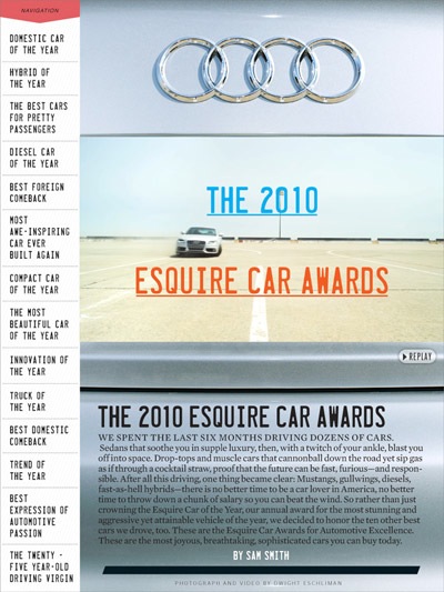
Another great example of video use is pictured below, for the issue’s “2010 Esquire Car Awards” feature. Unlike most times I experience video in a magazine on iPad — where you are clearly greeted by a video box — the intro video in the article is framed as if it was just another image, but gives a nice bit of motion to the intro page, especially fitting since we’re dealing with cars.
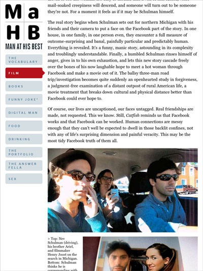
In terms of layout, the opening section of the magazine — the “Man at His Best” bits — follows a very blog-like structure (a constant sidebar on the left lets you navigate to the different sections), but the designers have managed to dress it up in a way that doesn’t feel too web-like, with an aesthetic similar to what you get in the print edition. When it comes to the “articles” though, some issues crop up.

The first thing to note is that all of the text in the magazine is in fact selectable, but that’s all you can do. No matter how many times I tried, I was unable to get the “copy” option to pop up, and so I don’t understand what the point of HTML-ing the text is, if there’s absolutely nothing you can do with it. Even stranger, the app includes a survey — I filled it out because you run a chance of getting a 6-issue subscription — and it mentions sharing features, but there are none to be found. Something that is planned but wasn’t ready in time for the launch of this issue?
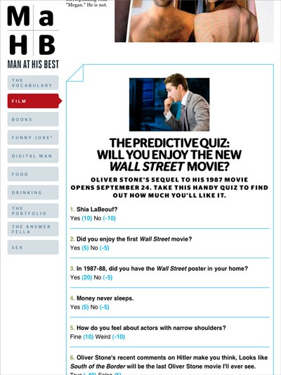
But the biggest issue I have with the text is that although it uses vertical page flipping instead of scrolling — something I generally prefer, as it’s done in Wired — the page cuts have not been clearly indicated, and so you end up with a lot of unreadable sentences that are cut in half (see below). Sure, you can hold your finger on the screen to gently move the page up or down to read it, but this is not very elegant, and these awkward cuts are found throughout — and as you see in the example below, they cut images as well.
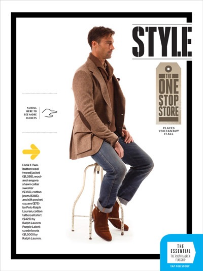
Other than that, you get a lot of interactive features like we’re used to seeing in Wired, like the fashion page below that lets you rotate the model, with his jacket (and accompanying description) changing on the fly. One problem I encountered a few times on these pages was lag when you started touching — other pages also took some time to load, so this is not limited to the interactive features.
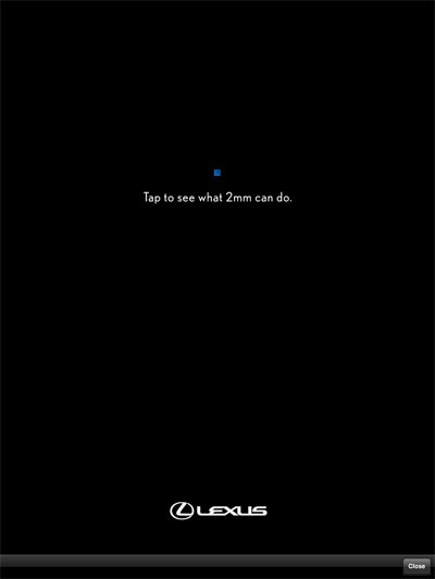
But the most annoying part of the magazine is how they’ve decided to handle ads. Unlike other magazines that include regular ad pages throughout, this issue of Esquire is entirely sponsored by Lexus. Now there’s nothing wrong with a magazine having just one sponsor, but it’s the execution that is annoying. Instead of being placed at regular intervals, it randomly pops up while you’re reading. And not only is it the same ad every time, but it’s an interactive ad (you’re supposed to zoom in with your fingers to see a video of a car in action) and it often takes a bit of time to load (or rather, to exit the page).
Another thing that I found slightly annoying was that I never had a good sense of where I was inside the magazine. The only table of contents that you can access opens up at the bottom of the screen, and there’s absolutely no indication of where you are in relation to the rest of the magazine.

Despite all these criticisms, it’s still an interesting first try, and from the editor’s intro, it does seem like they are looking to take in feedback and improve things for upcoming issues. Pricing is also a big problem — I’m certainly never going to buy another issue at $5 — but it does sound like they are going to be experimenting with that, just as they have with their iPhone app.