Icon

Your Guide to Design and Pop Culture in Tokyo

Wired Type Missteps

Wired on iPad

Just over a week ago the latest issue of Wired (September 2010) was released for iPad, and as I’ve done for all issues released for the device so far, I immediately bought it. Yes, despite the less-than-perfect way they’ve handled the digital conversion of the magazine, I’ve been enjoying the magazine, not only because of its nice price — for us Tokyo expats that is, although I still want an even cheaper subscription option — but also because I like the way it reads, and the way the material is presented (and those videos have been quite good too).

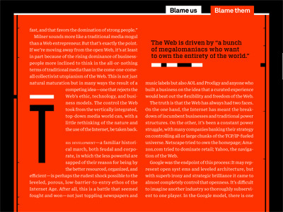
BUT, I was pretty surprised at some rather ridiculous flubs in the latest issue, both cases tied to the use of type. First example, pictured above, is an entire story — which also happens to be part of the issue’s cover story, “The Web is Dead,” which means it’s long — presented as white text on a red background. Really? Did anyone at Wired actually try reading the article after it was set in those colors? My eyes were practically in tears by the time I got to the end.

Wired on iPad

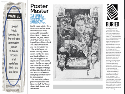
Next up was the use of type too tiny to read. The image above shows said article in landscape mode, and that “Buried” piece is where you encounter the problem — interestingly (if that’s the right word) enough, if you change it to portrait mode, it’s the page’s other article that becomes barely readable.

The big issue here is that these problems are tied to the fact that you can’t change type size in the magazine. So far it hasn’t been an issue for me because all previously issues were formatted in a way that made all text very readable on the iPad screen. I can appreciate that adjustable type size would ruin layouts, and I do like the layouts we’re offered in the magazine, but you can’t sacrifice readability just to make sure a column fits somewhere, or to attain a certain aesthetic (in the case of white type on red).

Have something to add? Feel free to leave feedback through either Twitter or Facebook, or contact me by email.

Tagged: , , , , ,

PauseTalk

PauseTalk is a regular series of events that take place at Cafe Pause on the first Monday of every month, with a start time of 20:00. The idea is to create a forum where Tokyo-based creatives can get together and discuss their own projects, as well as cultural currents of the city. The next edition happens June 4.

We hereby define a new term, that of the magaziner, described as a person who exerts an unhealthy amount of love for all things magazine. The Magaziner is a site that mostly focuses on the intersection between magazines and the digital frontier, and what it means for the medium. This does not preclude the inclusion of a healthy amount of print love.

Codex is a weekly music podcast hosted by Jean Snow, recorded in Tokyo. Playlists for all episodes are posted on the site, and you can subscribe to RSS feeds of posts and episodes.

Jean Snow is a contributor to Arcade Mania, your guide to the arcade gaming scene in Japan (Amazon US/Amazon Japan). He also provided assistance on Tokyolife: Art and Design, a guide to Tokyo's cultural output of the past few years, covering the works of over 80 influential creatives.
He will be contributing to the upcoming fifth editions of The Rough Guide to Tokyo and The Rough Guide to Japan, due for release in 2011.
PechaKucha

Jean Snow is Executive Director of the PechaKucha organization. He also helps run the PechaKucha Night in Tokyo -- please get in touch if you are interested in presenting at a future event. For a more intimate salon-like discussion group, join him at his monthly PauseTalk event.

A longtime resident of Tokyo, he lives and breathes design, pop culture, and gaming, sustained by an unhealthy addiction to magazines and frequent visits to his favorites cafes. He has reported on these obsessions for various online/offline publications, including the following: Time, Inside (Australian Design Review), Gizmodo, Gridskipper, Kotaku, 1UP, Tokyo Q, Superfuture, OK Fred, Arthur Frommer's Budget Travel, I.D. (International Design), Metropolis, Azure, MoCo Loco, Kateigaho International Edition, Wired's Game|Life, PingMag, CNNGo, Phaidon, and The Japan Times.

You can subscribe to an RSS feed of this site, and also follow him on Twitter and Facebook, or get in touch by email.


Colophon

The "Jean Snow" logo is written using the free Kirimomi Swash typeface. The "M31" logo is by Ian Lynam, and is part of a series of 31 unique designs. The site's design is based on the Grid Focus WordPress theme by Derek Punsalan.

Twitter