Jean Snow is Production Services Manager at Ubisoft Shanghai.
Previously, he was based in Tokyo for over 15 years, where he lived and breathed design, pop culture, and gaming, sustained by an unhealthy addiction to magazines and frequent visits to his favorites cafes (he was also Executive Director at PechaKucha). He has reported on these obsessions for various online/offline publications, including the following: Time, Inside (Australian Design Review), Gizmodo, Gridskipper, Kotaku, 1UP, Tokyo Q, Superfuture, OK Fred, Arthur Frommer’s Budget Travel, I.D. (International Design), Metropolis, Azure, MoCo Loco, Kateigaho International Edition, Wired’s Game|Life, PingMag, CNNGo, Phaidon, and The Japan Times.
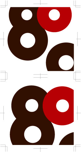 This is the new label design, by Konstantin Grcic, for the Japanese sake brand Hachituru. More images here (link via Dezain.net), and you can also pick up the latest issue of AXIS (117, the one with Kenya Hara on the cover) for an article in English covering the design process.